Family Park
The preparation of the brand identification and basic promotional materials.
Solution
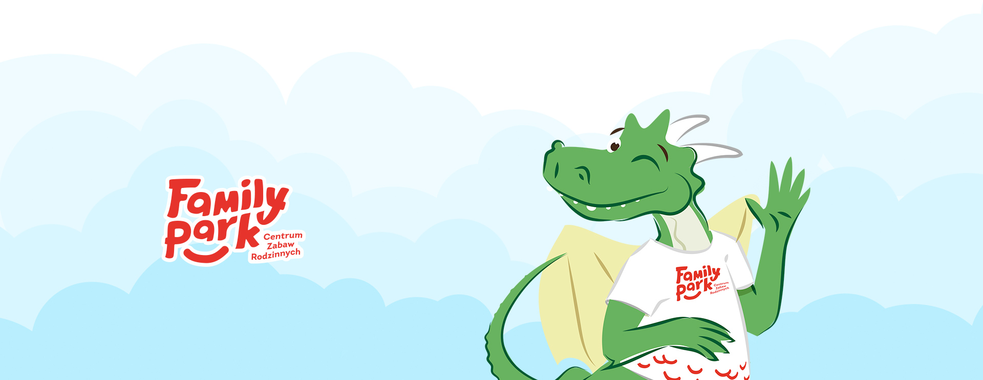
Family Park is a place of active recreation for all family members of different age. The character of the centre is resembled in the logotype due to dynamic, slightly wavy form which implies movement and fun, and softly finished, non-aggressive hand lettering matching association profile of Family Park. Line thickness and light between the letters were selected to ensure optimum balance between readability of the sign when small, and its powerful message when magnified. The dynamic form of the sign contains additional foot note and graphic element in the shape of a smile/underline which locks a block of the sign into more condensed shape. It allows the sign to separate itself from other graphic elements e.g. in newspapers or other promotional materials. Additionally, “smile” functions as KV (key visual) of the brand, which had been applied in the following examples of branding in the shape of “dragon scales” referring to the new mascot of the centre.

Identyfikacja
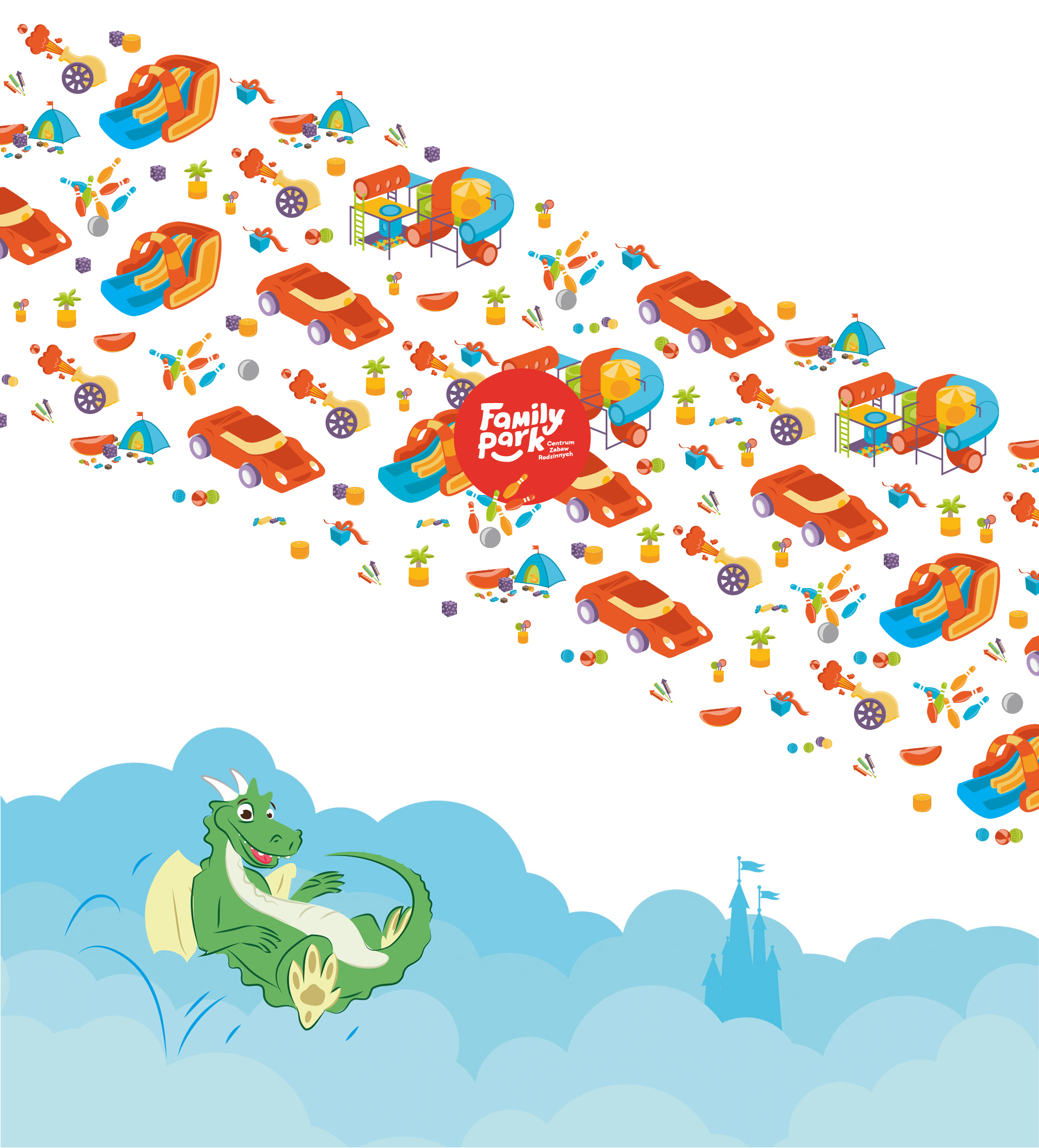
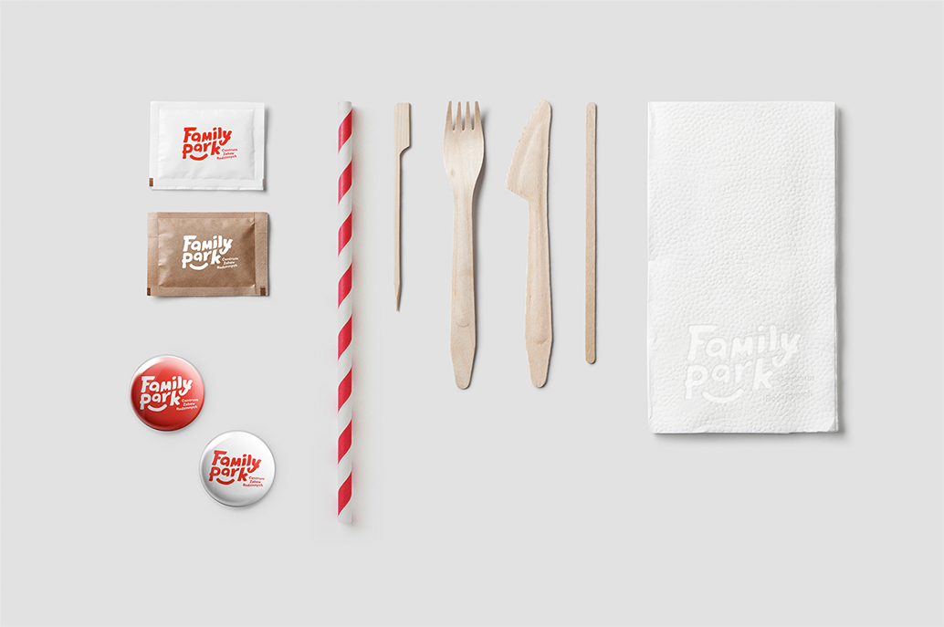
The idea of whole visual identification is to combine the logotype with already existing mascot of Family Park. The bonding part is the graphic element in the form of multiplied “smiles” resembling scales (the ones of a dragon in this case).
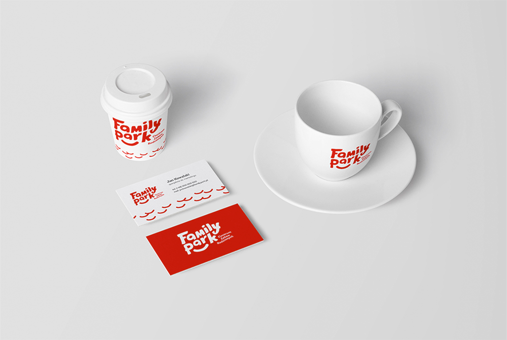
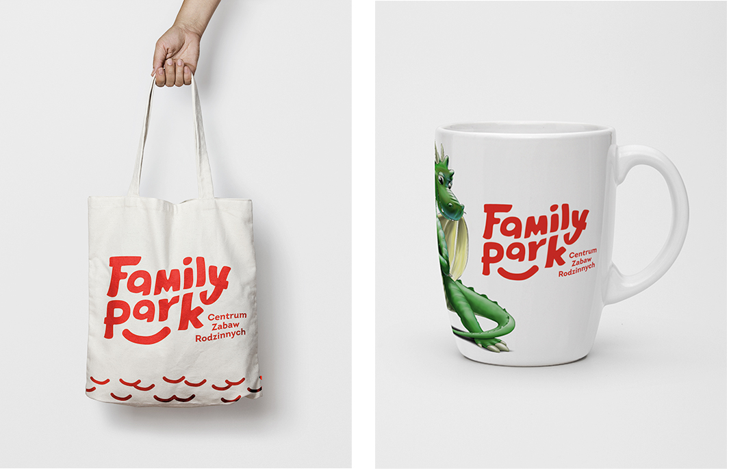
“Dragon scales” may be applied on all promotional materials constituting identification elements of the brand. They should not be used as an independent graphic element but as an addition to the logotype. The mascot also is not a self-contained part of the image and should be used together with the logotype.
Website
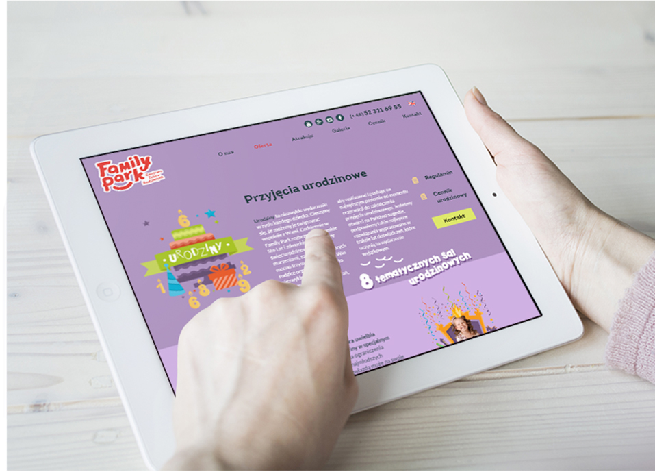
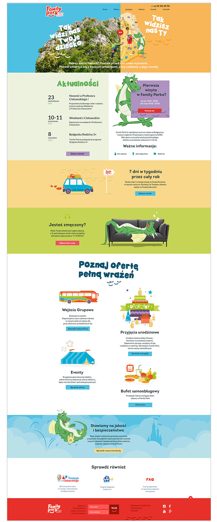
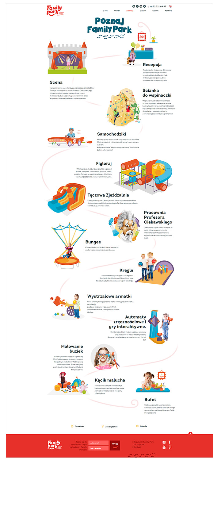
Our task was to design and implement new, attractive interface of the website. Thanks to new KV we managed to adjust layout to client’s requirements of an easy access to the most important information, even in a responsive form.
Numbers
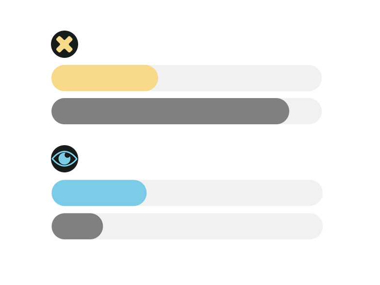
Bounce rate i.e. rejection rate
(a user sees only one page and leaves it)
86% → 36%
Returning users
(new users who return to the website)
10% → 30%
Mobility
